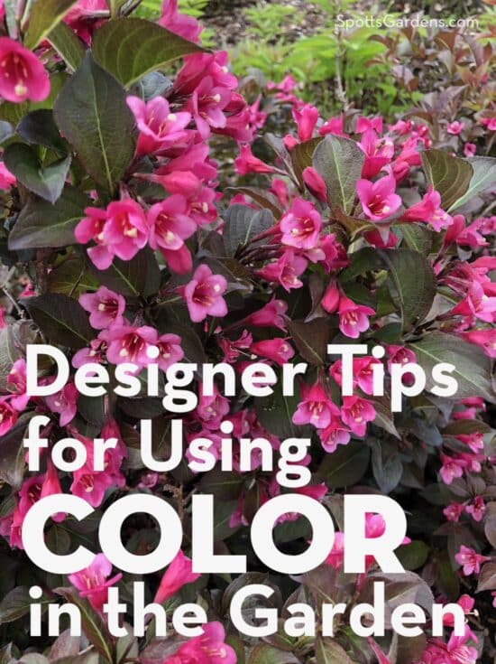
Color dramatically affects how your outdoor space feels. But using it well takes a little practice! Check out some of our strategies for making the most of the hues you choose.
1. Green is a neutral.
Working with foliage and flower color isn’t quite the same as working with paint colors.
- Red, fuchsia, yellow, and orange are hot colors that draw the eye. Their pastel versions—soft pink, peach, and butter yellow—also also draw attention. But because their intensity isn’t as high, pastels don’t pull your focus as aggressively as pure hot colors do.
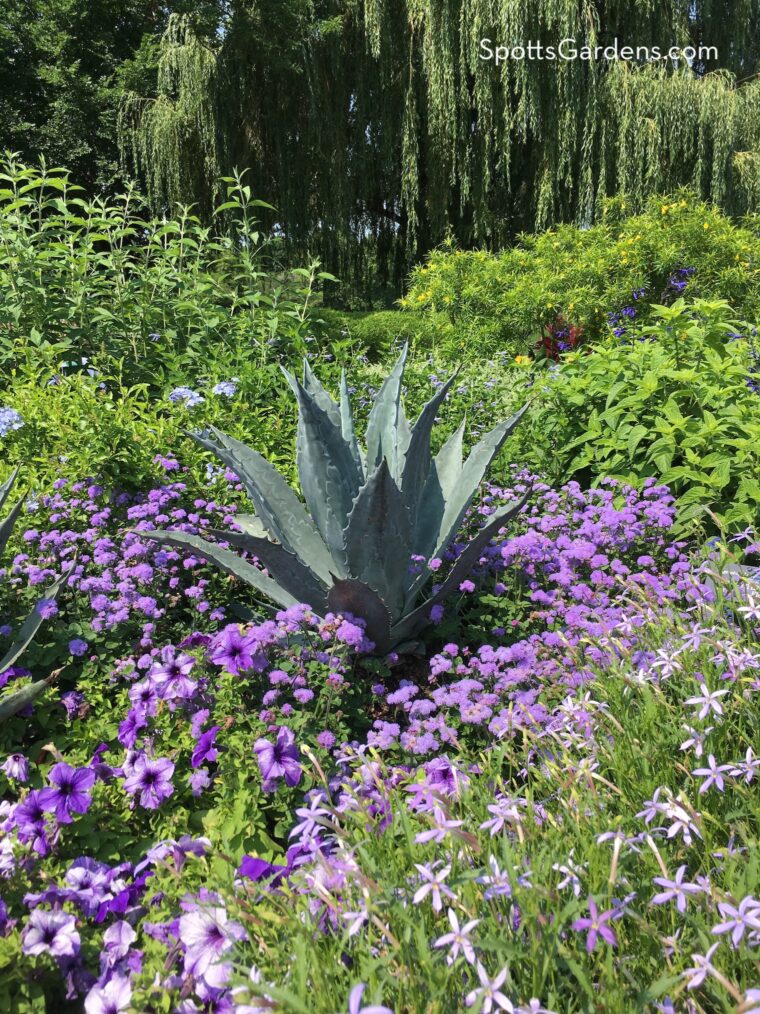
- Blue, purple, and dark maroon (sometimes called black) are cool colors. Cool colors look like they’re moving away from you. They are easiest to see when used up close. In the photo below, taken at Chicago Botanic Garden, you can see that the blue-tinted agave and purple flowers look cool, even on a sweltering summer day.
- In the garden, green, white, silver, and grey are neutrals and go with all the other colors.
Some easy ways to mix colors are:
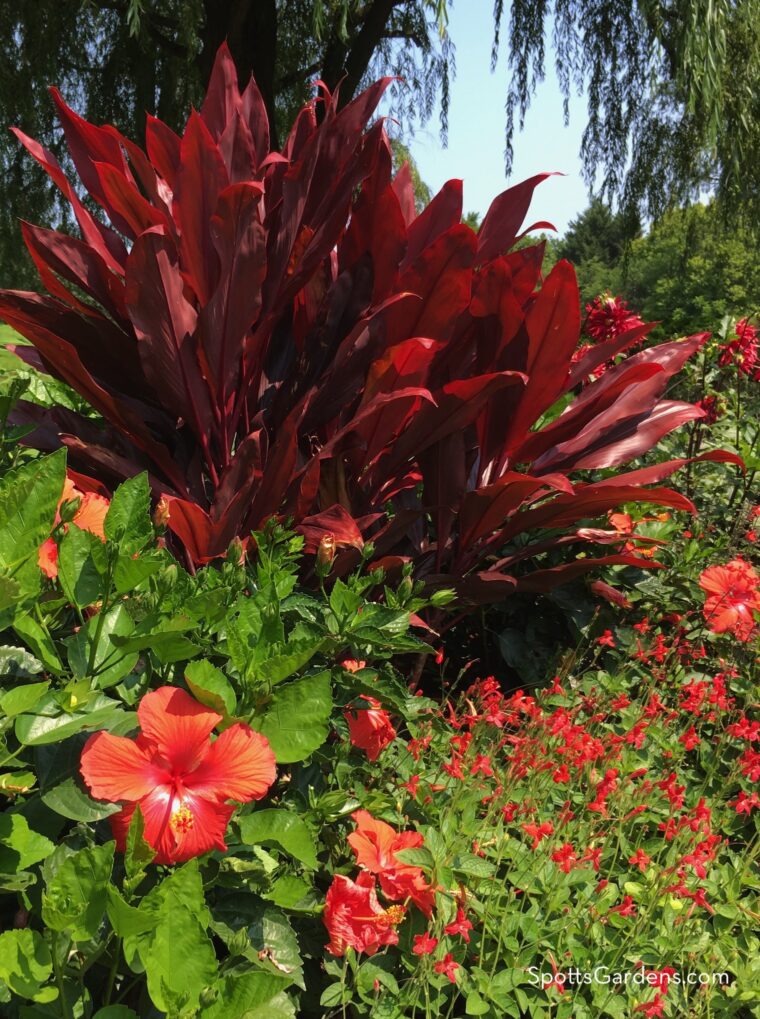
- In a monochromatic scheme, where you use light and dark tones of the same color. In the photo below taken at Chicago Botanic Garden, red hibiscus and penstemon are planted in front of a red-leafed cordyline.
- By using all hot colors together with neutrals, or all cool colors together with neutrals.
- In multicolored scheme where the colors all have the same intensity. It’s easy to mix all bright colors together or all pastel colors together; combining different intensities of different colors is trickier.
- If a combination clashes, add neutrals. Green, silver, white, and grey can all help soften contrast, as can blue and purple.
- If you’re creating a garden meant to be seen from a distance, hotter or lighter colors will be easier to see than cool ones will.
- In a small garden, you can use color to suggest a bigger space. Use cooler colors around the perimeter; they’ll give a suggestion of distance.
2. Start with foliage.
Flower color comes and goes, but you see foliage throughout the growing season. So consider using foliage colors as an accent in otherwise green borders. Repeat your accent color at least three times to lead the eye through the garden.
Maroon to “black” foliage creates depth in the garden and works especially well in a monochromatic color scheme with pink or red flowers. Plants with purple-leafed foliage include Japanese maple, smokebush, ninebark, coral bell, and weigela.
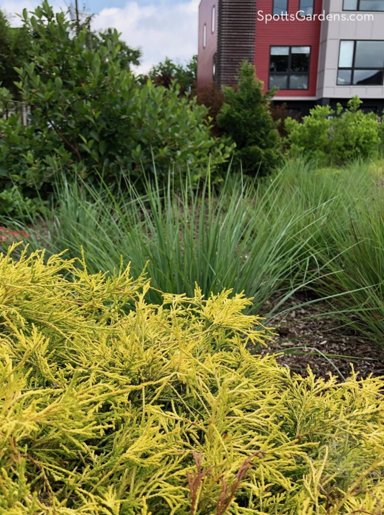
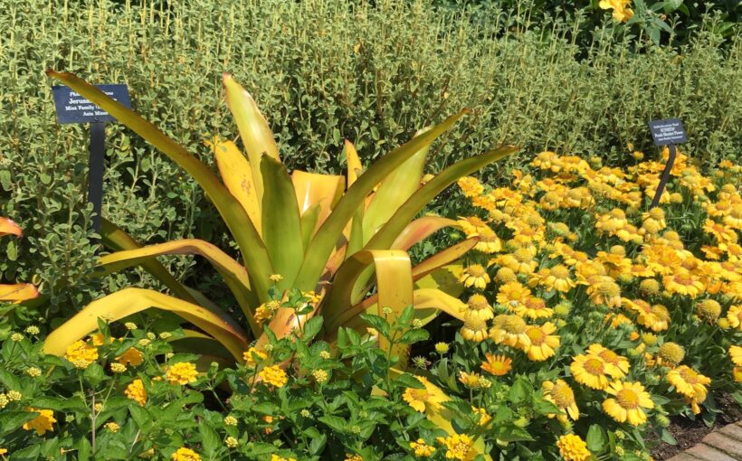
Chartreuse lightens up shady spots and is a high-contrast companion to bright colors like red and orange. Plant possibilities include Japanese spikenard, sedge, false cypress (shown above), coral bells, and ninebark.
Silvery blue cools down borders and introduces a Mediterranean flavor to the garden. It’s particularly lovely with soft pink and whites. Plants to consider include wormwood, blue fescue, blue hostas, St. John’s wort, juniper, Russian sage, and little bluestem.
Other leaf colors are available as well, so take a look through a local nursery to see what catches your eye.
3. Group color for best effect.
Get the most impact in your garden by planting multiples of the same plant together, creating swathes of foliage and flower color.
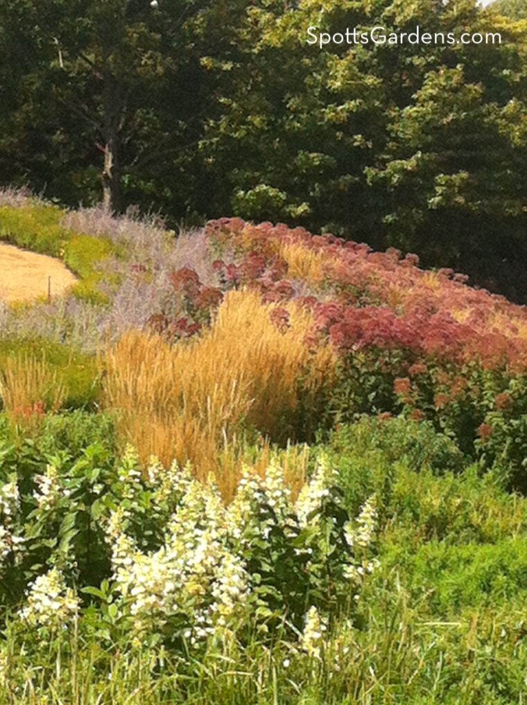
You can see this effect in the photo above from Chicago Botanic Garden. Big masses of sedum and the purple of Russian sage are visible even from a distance.
The larger the garden, the more plants you can use in a grouping. But even in a small garden, use three, five, seven, or ten of the same plant. Where space allows, even shrubs have more impact when planted in stands of at least three.
4. Uneven proportions make color more interesting.
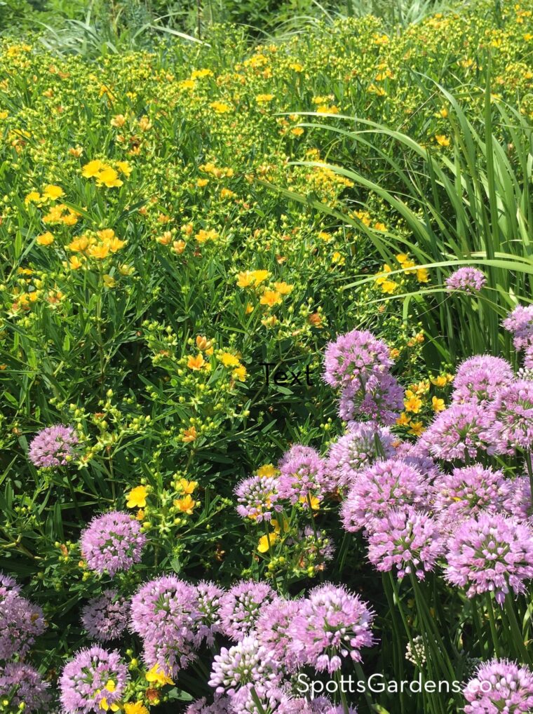
Using Two Colors: When combining two colors, choose one to be the main color and one to be the accent. Use two or three times as much of the main color as the accent color. This trick has even more impact when the two colors are complementary (opposites on the color wheel); you can see it in the photo below of yellow hypericum and lavender allium.
Using Multiple Colors: When using several colors in the garden, choose one or two main colors and put other colors in a supporting role.
Repeating Color: Try using one color as a throughline in the supporting role. For example, you might repeat low-growing catmint or coreopsis in several places to pull the eye through the garden.
This technique works with human-made accents too. Use the same paint shade on at least three elements in the garden, like a bench, fountain, and planting container.
5. Color changes with the seasons.
Remember that the colors we see are the result of light. And as the quality of sunlight changes with the seasons, the plant colors characteristic of each season change too.
Spring
Garden colors in spring tend to be clear and soft, with a lot of yellow in the leaves. Just think of how trees leafing out look like a wash of “spring green,” a much more yellow green than the darker green of summer.
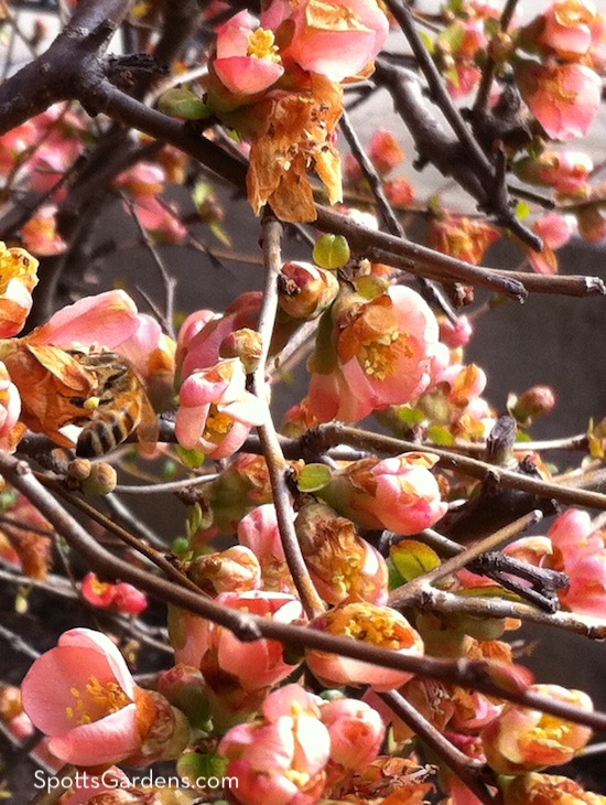
Peonies, iris, and the blooms of spring-flowering shrubs are usually pure hues; they aren’t hazy or brassy at all. Think of the clear coral of quince blooms (shown below), the strong fuchsia of azaleas, or the soft pink of the ‘Sarah Bernhardt’ peony.
Summer
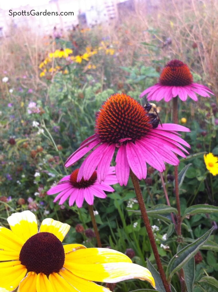
But those soft pinks and clear yellows that are so pretty in spring can get completely washed out by strong summer sun. You can see in the picture below that the pinks of summer flowers seem to have an almost magenta cast, while the yellows are brassier, with more orange. Those strong flower colors stand out in the hot sun and do a better job of attracting pollinators. Purple-pink coneflowers, golden black-eyed Susans, and late-summer goldenrod are good examples.
Autumn
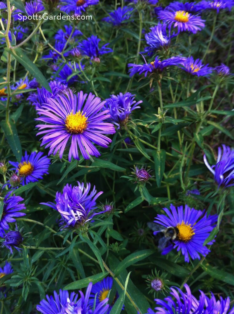
By fall, flower color shifts again. As leaves turn, they become brilliant tones of gold, orange-red, and deep maroon. Fall flowers—like those of mums, asters, and anemones—have a warm, slightly dusty quality. You can see this in the asters shown below. Their yellow undertones pick up the warmth of September’s golden light but appear a bit cooler in the clearer light of October.
As a result, even a garden devoted to one main flower color will change in tone through the year. If you focus on pink in your garden, you’ll likely have softer, clear pinks in the spring, while your summer zinnias, daylilies, and coneflower will be more magenta and mauve. Fall’s asters and mums will have a dusty, warm tone. Color changes!
+1 Color is personal.
How you use color in your garden depends entirely on your personal tastes. Our guidelines are suggestions that we’ve found useful, but certainly not hard-and-fast rules. Experiment to find what works best for you!
Want us to design a garden with your perfect color scheme in mind? Contact us for a free estimate.